Why use Viva Connections Adaptive Cards for your SharePoint Intranet
An intranet ‘dashboard’ with quick access to all the systems and tools people need for their jobs has been the goal for many intranet owners for years. Up until recently, it took quite a bit of custom development to build a truly useful dashboard though.
Adaptive Cards, and their integration into Viva Connections makes it easier to add actionable data to a dashboard on a modern SharePoint intranet.
In this article, we’ll explain Adaptive Cards, show why they have benefits through examples and discuss how to include them on an intranet with Viva Connections. For background, we described an overview of the Microsoft Viva employee experience suite in a past blog post.
What are Adaptive Cards?
Adaptive Cards is the backing technology behind the Viva Connections dashboard.
At their core, Adaptive Cards are platform-agonistic bits of user interface (UI). In other words, they are made to adapt seamlessly into different UI and apps. Microsoft’s vision is that they can be used in all kinds of apps, but so far, they are mostly in Microsoft-owned services.
You’ve probably already seen Adaptive Cards in Microsoft apps such as Teams, Outlook or even Cortana. Here are a couple of examples of Adaptive Cards – a stock quote in Cortana and a Power Automate post in a Teams chat:
Adaptive Cards examples - Stock quote card in Cortana and notification in Teams
One of the key benefits of Adaptive Cards is that they work across devices and platforms. For example, an app developer could build an Adaptive Card to add to Teams or SharePoint and it would work across mobile and desktop platforms. As a technology, they let app developers focus on the content and what the app needs to do, rather than all the ins-and-outs of what the card looks like.
Here’s a great explanation of the benefit of using general Adaptive Cards:
“Adaptive Cards is a technology, that lets you to focus on content and layout, not how it will be displayed on a specific device or browser. What you are responsible for is to prepare what to show and how it should be organized, e.g. should there be any tables, images, columns…The host is an application, that displays Adaptive Card. It controls the colors, fonts, specific parts of layout, buttons’ shapes, backgrounds and almost everything that makes the Card to look, once displayed, as if this is just another piece of the user interface.”
From: Microsoft Tech Community
Using Adaptive Cards for a better intranet
The Viva Connections dashboard is composed of an actionable set of tiles to link to and bring in data from both Microsoft 365 and 3rd party tools such as an HR system, time tracking, Service Now, etc. The dashboard is accessible through a web part on the homepage:
Viva Connections Dashboard webpart embedded on a SharePoint intranet homepage. Image courtesy of Microsoft
Scenarios
One of the best ways to brainstorm Adaptive Cards for your own intranet is to learn from examples and scenarios. Let’s dive into a few ideas for business scenarios you could enable with Viva Connections:
HR/People
Connect to your employee self-service app to show benefits and time off info. For example, give people quick answers to common questions such as ‘how many days off do I have left?’ and ‘what’s left in my flex spending account?’ through tiles that show personalized vacation days and/or benefit information. These tiles can link to the right place in the Employee Service application such as SAP for ease of use. These dynamic, personalized tiles have the benefits of being relevant to a user, and save people time in looking up the data.
Learning
Another HR/IT scenario is giving employees quick access to learning or training. The dashboard could show required training, a targeted link to learning resources, or the next modules in a certification track. This could draw from your Learning Management System, such as SuccessFactors, or Viva Learning.
The card can also display a link to a FAQ or knowledge base, or even display some of the key FAQs in a quick view.
Productivity
A couple of scenarios that tie to productivity is submitting a daily/weekly timesheet and tracking tasks. The dashboard could be a reminder to submit time by showing hours tracked week-to-date or hours not submitted and link to the corporate time tracking application.
If you want to encourage people to use Planner, you can show tasks assigned within Planner relatively easily with the Viva Connections dashboard. There is a tile that displays the first task assigned to someone in Planner, and links to the board:
Finance
Help employees manage their expenses, approve invoices or contracts, or view the latest stock price with dynamic Adaptive Cards:
Surveys/Forms
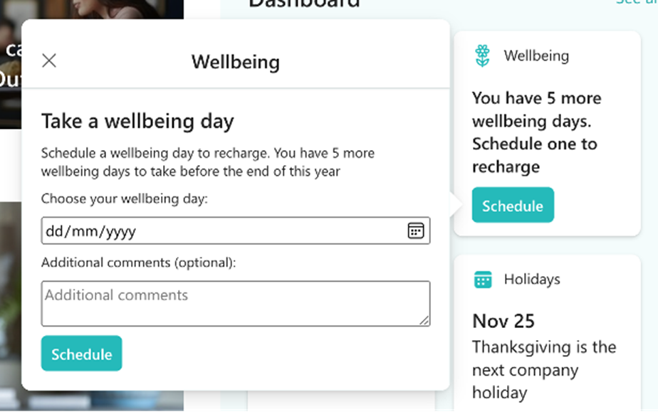
If you have a short form that people need to fill out, such as a health check or request time off, you can embed that in a ‘quick view’ of the card. This is designed for short form input, and people don’t have to open another application to enter data. Here’s an example of a simple form displayed in the quick view:
Data
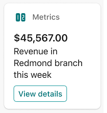
Like the finance Adaptive Card examples, you could also surface general team metrics or pull data from a Power BI dashboard or Excel file:
Hopefully these examples give you an understanding of why Adaptive Cards are useful on an intranet, as well as some inspiration for your organization’s intranet.
Adaptive Card design recommendations
Based on our experience and advice from Microsoft, here are design recommendations for Viva Connections Adaptive Cards on a dashboard:
Use what already exists
Think about what you want to promote in a dashboard that already exists on the intranet. Examples could be corporate policies, learning or training courses, FAQs, knowledge bases, popular forms, or tasks. There’s no need to duplicate this content in Adaptive Cards, but rather surface something useful through integration and link to these sources instead.
Less is more
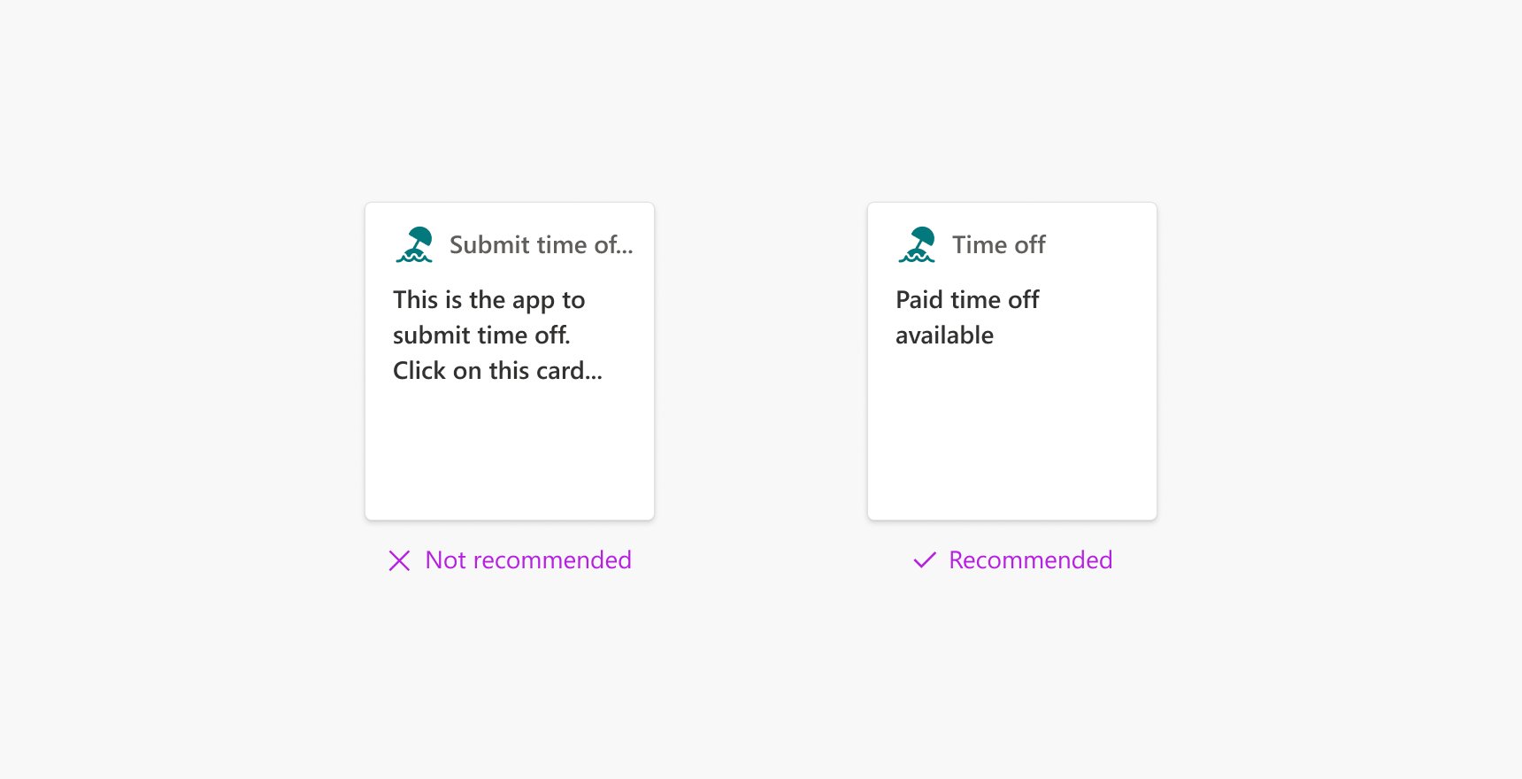
Highlight what’s most important for people to see at a glance, and minimize the amount of text or labels as much as possible. 10-12 characters are recommended for the title that’s next to the icon, and test if the main heading / description area has truncated text in desktop and mobile views.
Add dynamic data
Users will be drawn to cards that have dynamic and regularly refreshing data, so mix in dynamic cards with more static ones. For example, add dynamic data with the company stock price, number of active tasks, days off remaining, or the next statutory holiday. These cards take more planning and time to build, but it’s possible to build simple scenarios where data comes from a Teams app or list without too much developer knowledge.
Vary size and images
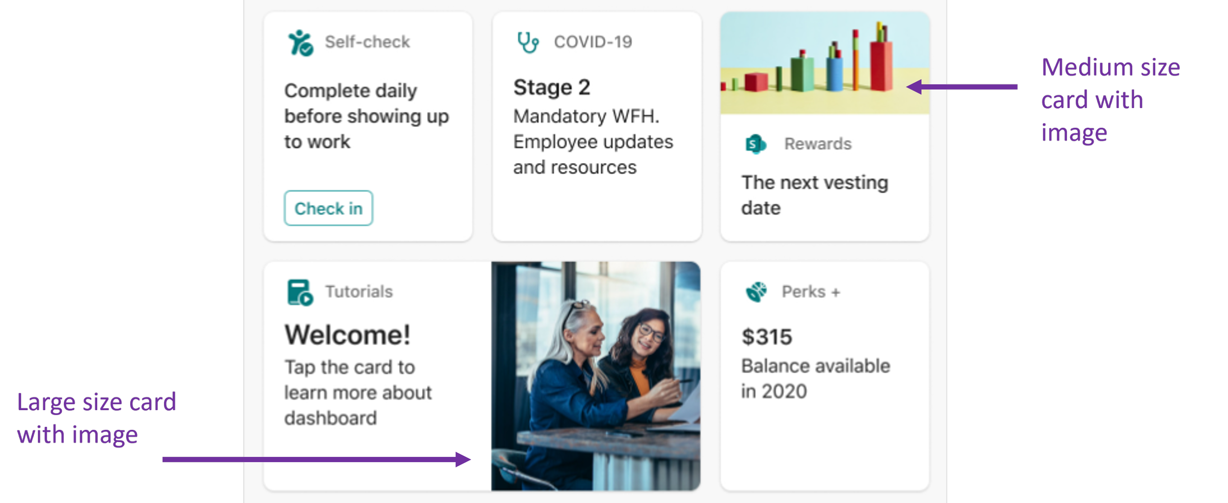
There are 2 standard sizes for cards. To help users differentiate between cards and to create visual interest, you can add a couple of big sizes and use images to break up the text.
How to author the Viva Connections Dashboard
So are you ready to tackle building your own Adaptive Cards? After you setup Viva Connections (a guide is here), you’re ready to edit the dashboard.
To edit the dashboard, go to ‘Setup Viva Connections” in the settings menu, which expands the property pane, and click ‘View Dashboard.’ This goes to a dashboard.aspx page saved behind the scenes in the Site Pages library. From here, you can add and re-arrange tiles, and preview them in mobile and desktop experiences.
Viva Connections Dashboard in Edit mode
The hardest part about designing useful, actionable and personalized cards is connecting to a data source. This is where some development knowledge and experience is required.
A helpful developer tool is the Adaptive Card Designer (ACE) to preview what a custom card will look like with. Again, since the Viva Connections Adaptive Cards are built on the Adaptive Card Framework, you only need to focus on your component's business logic and let the SharePoint Framework (SPFx) handling make your component look good and work across all platforms.
Some developer knowledge and setup are useful to build custom Adaptive Cards. This includes:
Ability to develop JavaScript applications using modern web technologies
Basic knowledge of TypeScript and JSON
A code editor or IDE installed
Node.js v14 installed
There are good tutorials from Microsoft that go through installing the SharePoint framework and building your first Adaptive Card.
Summary and more learning
Usually, intranets have limited actionable refreshed data. With Adaptive Cards, intranet managers can add dynamic data, support quick inputs and surface relevant information to specific audiences from the homepage. We recommend taking advantage of Adaptive Cards with Viva Connections since it’s included with every paid SharePoint plan.
Start your journey with Adaptive cards and the Viva Connections dashboard with these resources:
https://adaptivecards.io – Documentation, JSON schema explorer, a few examples and the visual designer
https://madewithcards.io/ – the repository of community built Adaptive Cards examples
Microsoft Learn tutorial to understand how to extend Viva Connections with Adaptive Cards


