SharePoint intranets — the mobile experience
Mobile access for an employee portal, or intranet is no longer an afterthought with SharePoint Online. Much has changed since the early days of SharePoint!
A mobile intranet is built into modern SharePoint in three key ways:
Sharepoint app
Teams app with Viva Connections add-on
Mobile browser
This article describes each option and our design recommendations for a modern, mobile intranet.
1. SharePoint app
As the easiest option, we recommend using the SharePoint app for mobile intranet access. This app can be installed on iOS, Android or Windows 10 Mobile devices. Your IT department can also deploy it to corporate devices using Mobile Device Management (MDM) or Mobile Application Management (MAM) software such as Intune.
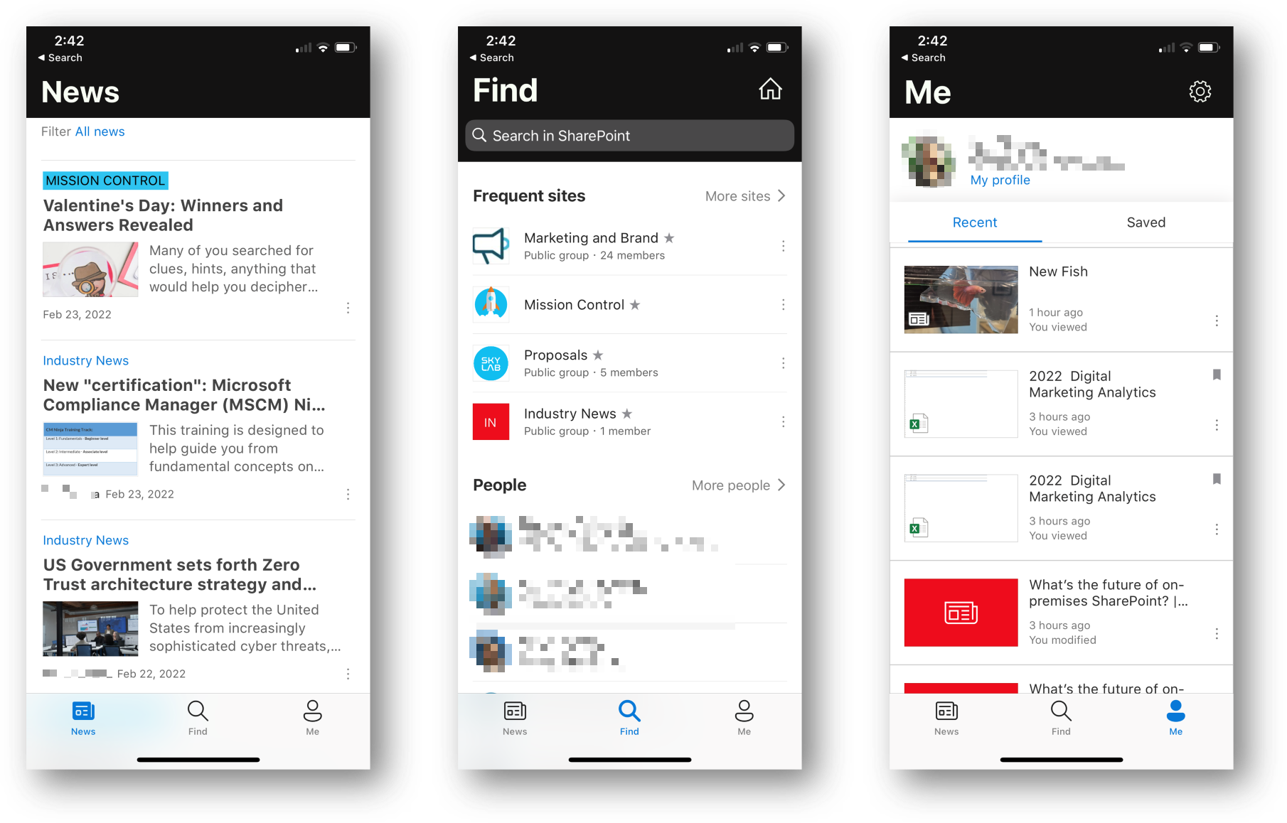
The SharePoint app is designed to show:
News from your organization and teams
Quick access to sites that you follow and people lookup
Recent and saved documents
SharePoint mobile app – News, Find and Me tabs
One of the benefits of SharePoint modern pages is that they are designed to work well across desktop and mobile. Responsive design is built-in, and as an author you don’t need to do anything extra to create well-designed pages that adapt to mobile screens.
How do employees access the entire intranet?
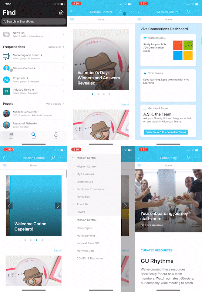
In the default views, the SharePoint app surfaces information that is relevant in a mobile context. However, Intranet Owners often want all sites and pages on the intranet accessible. This is possible through the SharePoint app using the home icon in the top right of the screen:
Mobile intranet navigation example
Clicking the home icon loads the home site landing page, which users can navigate just like any other page. From there, users tap the ‘hamburger icon’ in the top left to expand the navigation menu as shown in the GIF above.
To build a usable navigation, we recommend:
Group the items into no more than 5-7 top level items
Limit the hierarchy to 3 levels
Build landing pages for each major section. This allows a user to tap on a major section, see the list of sub-categories, and navigate further in the site.
2. Teams app + Viva Connections
With this option, the intranet is displayed in Teams through Viva Connections. People are spending more time within Teams to collaborate and chat, so it’s becoming a more natural place to access an organization’s intranet.
Viva Connections is included with Microsoft 365 enterprise licenses, so it’s a no brainer to take a few steps to enable it. We shared instructions and advice for Viva Connections in a past article.
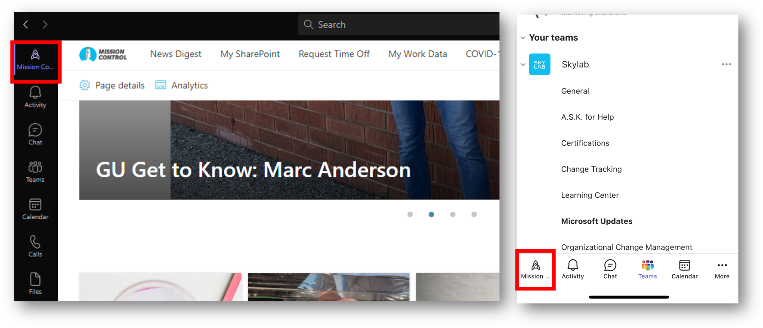
To access the mobile options in Teams, an IT administrator adds a custom tab to Teams using Viva Connections. The tab shows up in both desktop and mobile Teams apps as so:
Intranet tab (Viva Connections) in desktop and mobile Teams apps
The Viva Connections app creates a custom app in Microsoft Teams which appears as a branded company app in the Microsoft Teams app center. Once the app is added, your intranet icon will appear in the Teams app bar in the desktop and mobile Microsoft Teams experience as shown above. Users won’t see the app by default if you don’t pre-install and pre-pin.
Providing this option to users requires a little more planning and design than just deploying the SharePoint app. This is because the default experience in the mobile Teams app displays the intranet in three tabs: Dashboard, Feed and Resources.
The Viva Connections mobile app tabs in Teams
What each area does:
Dashboard – brings together tools employees need in one place using cards or tiles.
Feed - displays targeted conversations from Yammer, SharePoint news, and Stream based on audience targeting and the groups employees belong to.
Resources - displays your intranet’s global navigation from the SharePoint app bar to access the ‘entire intranet.’
Technical Note: Viva Connections for the Teams mobile app can be enabled only after a a dashboard is created. You can still ‘turn on’ Viva Connections for desktop without a dashboard.
The Dashboard requires the most planning and design after you build the global navigation structure.
In a recent post we shared advice and examples for Viva Connections dashboard adaptive cards. A brief summary of the design recommendations for Viva Connections dashboard cards include:
Start with systems and data you already have – for example the CEO blog, learning, and HR tools are good places to source dashboard data
Use a mix of static (cards that have links) and dynamic cards that display personalized data
Design cards with a mix of text and images
Mobile intranet access through Viva Connections is a highly useful experience to enable as your staff uses Teams more often, so it’s worth taking the time to design a great mobile experience.
3. Mobile browser access
The tried-tested-and-true, but probably most clunky option for mobile intranet access, is through a mobile browser. This is a good option if the device doesn’t have the SharePoint or Teams apps installed, or the apps can’t be installed for some reason.
Just like any other website, a user opens the intranet in a mobile browser such as Safari or Google Chrome. After signing in, the page will load in a mobile-friendly view with a responsive page layout. It looks very similar to the SharePoint app when navigating the entire intranet.
We recommend that users use the latest versions of Microsoft Edge, Firefox, Safari, or Google Chrome to load a mobile intranet.
Bonus topic: What about Power Apps, Forms, Reports, etc.?
If you’ve added any components such as Power BI reports, Power Apps or Microsoft Forms to your intranet, they will load in the SharePoint, Teams and mobile browsers.
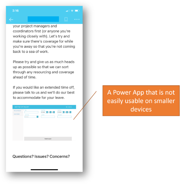
However, they might not be optimized and/or usable in mobile views, depending on how you designed and implemented them. In this example below, a Power App is added to a SharePoint page for requesting time off. However, it was designed for desktop use, and is too small to use on a smaller mobile device like this:
Example of a Power App that is not optimized for mobile devices
In this case, we need to implement the leave request form as a responsive form in Power Apps. This is possible by using relative layout options and formulas in the Power Apps Studio. It’s a little more advanced to build forms this way, but there are tutorials online for help.
For Power BI, or complex reports, you may want to direct users to standalone apps for easier interaction with the data.
In Summary
We hope this article helps you plan and design a great mobile experience for your SharePoint intranet. Once you move to SharePoint modern sites and pages, the mobile views are built in through the Microsoft 365 SharePoint mobile app and mobile browsers. With a little more effort to create a dashboard, the mobile intranet is even better with Viva Connections and the Teams app.
Are you enabling scenarios on your mobile intranet? Reach out for more advice or help — we’d love to chat!


